Table of Content
The online shopping landscape is full of choices.
When shoppers can’t find what they’re looking for in one store, there are plenty of others serving up what they need.
While the sheer amount of options is great for consumers, it can make it difficult for brands to build a base of loyal customers. But when this is the most effective way to grow and scale, you don’t really have a choice (after all, consumers are increasingly seeking out brands they can connect with).
Generate leads with engaging email popups.
Collecting customer email addresses lets you continue to nurture the brand-buyer relationship long after a sale has been made.
The tricky part is getting visitors to hand over their sacred email addresses.
This is where email popups come into play.
They’re a crucial part of building your email list. If they’re not up to scratch, you could be missing out on capturing leads and converting future buyers.
Want to avoid that?
Here are five ways you can level up your email popups and attract more subscribers along with a collection of inspiring Shopify popup examples.
Collecting customer email addresses lets you continue to nurture the brand-buyer relationship long after a sale has been made.
1. Offer an incentive
Who doesn’t love a discount? Everyone likes to feel they’ve saved a bit of cash but, more importantly, consumers want to feel special and valued.
For Shopify stores to really connect with their customers, they have to treat them well - after all, no one’s going to stick around if they get ignored or pushed to the end of the line.
Offering an irresistible incentive captures the attention of visitors and makes them feel like they’re getting something in return.
It’s a win-win situation: customers get a bonus treat and you get a new subscriber and an extra sale.
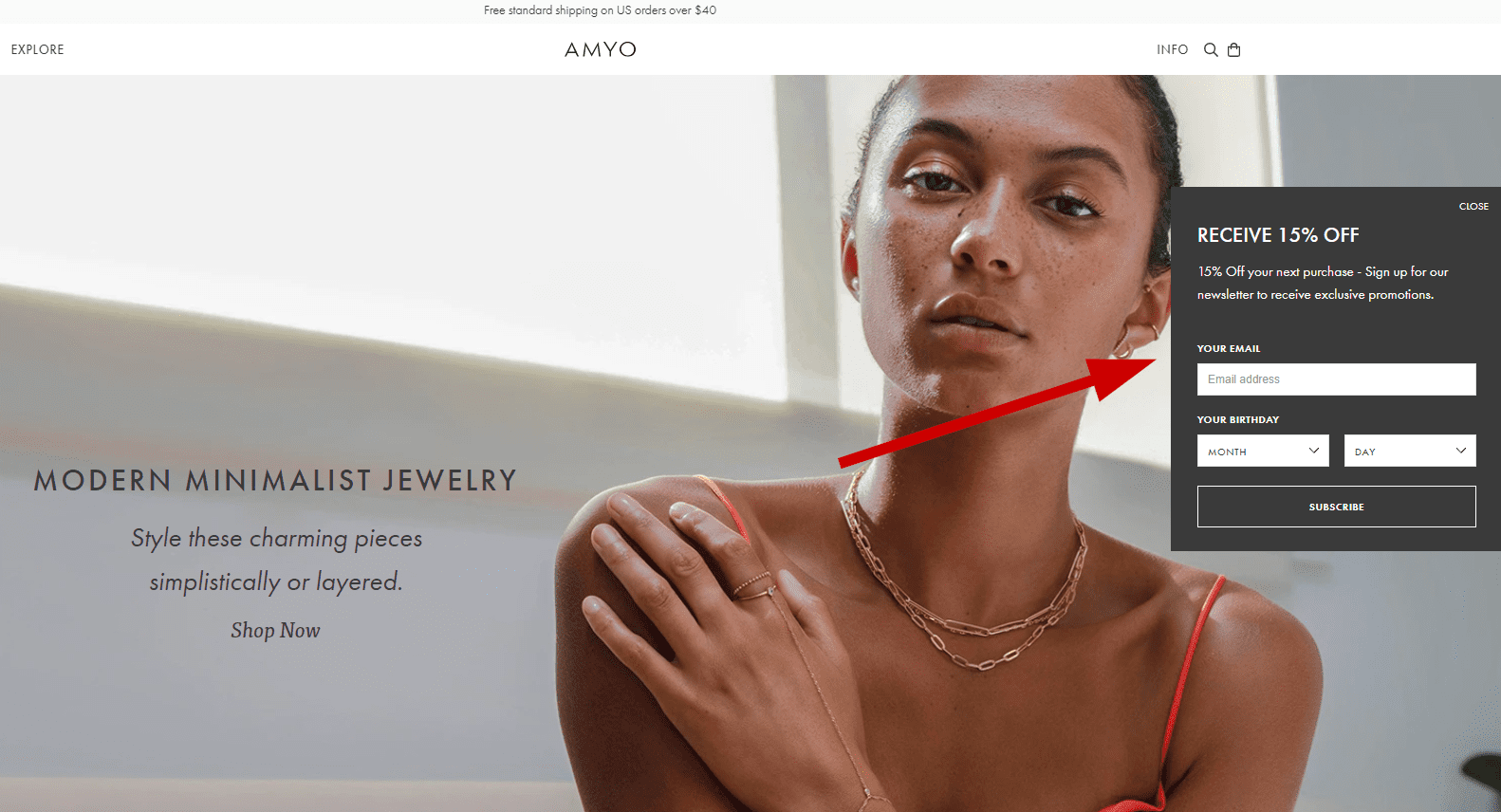
Take Amy O as an example.
They offer subscribers a 15% discount on their next order. Visitors want to take advantage of the offer and it encourages them to make another purchase.
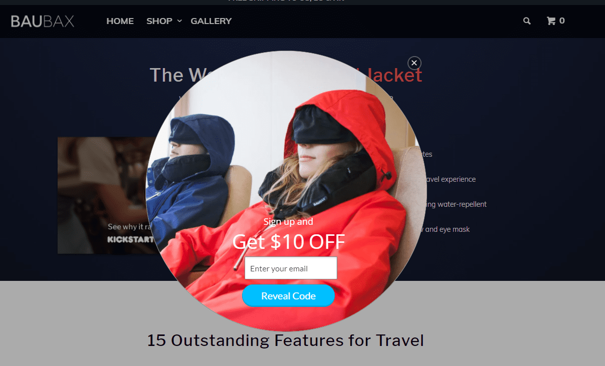
Similarly, Baubax offers a discount.
But, instead of a percentage off, they give a standard $10 discount for visitors that sign up.
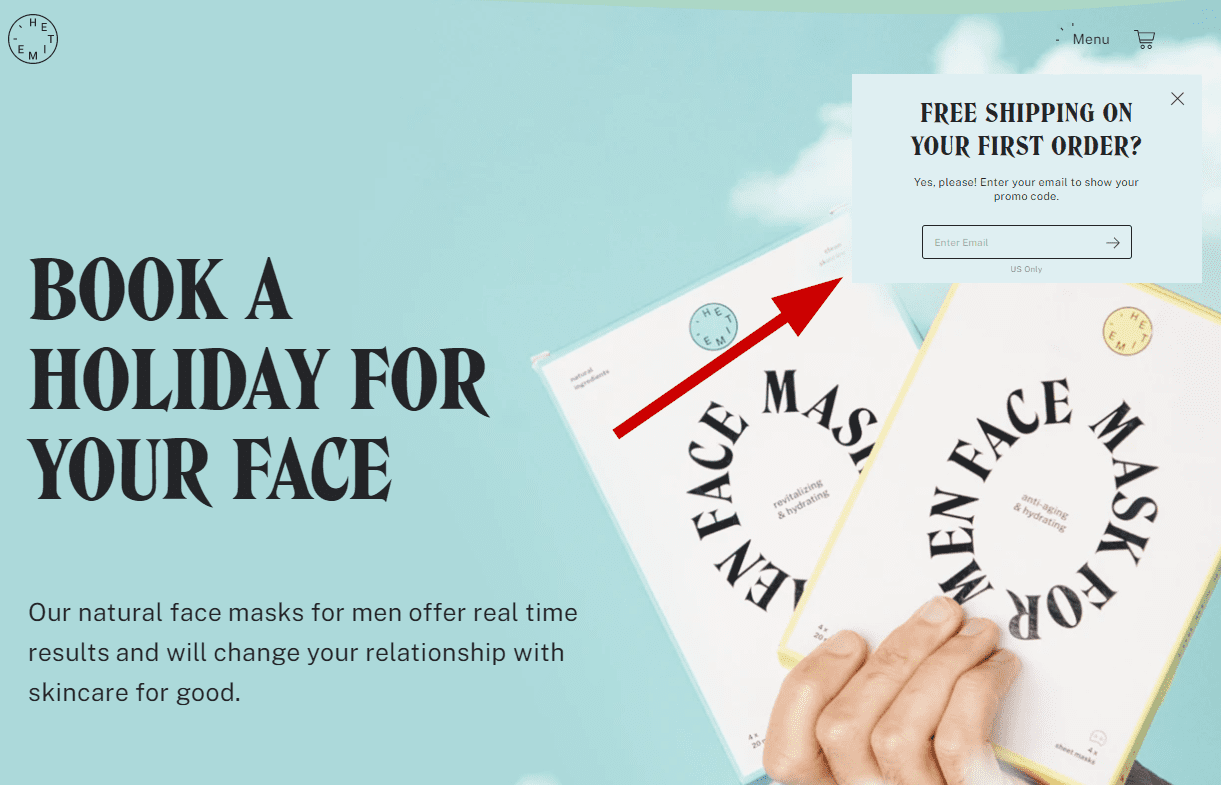
Or you can do what Shopify-powered HETIME does and offer free shipping. They promise visitors free shipping on their first order if they sign up there and then.
2. Capture people before they leave
Online shoppers are serial browsers.
They regularly add products to their carts and then leave them to gather dust. In fact, the cart abandonment rate sits at a whopping 68.57%. That means only 30% of visitors that add items to their cart go on to buy them.
But just because people leave your site, it doesn’t mean they aren’t interested in what you’re offering. They might have been distracted or have gone elsewhere to compare deals.
Exit-intent popups are an easy way to recapture their attention before they hit the dreaded “close tab” button.
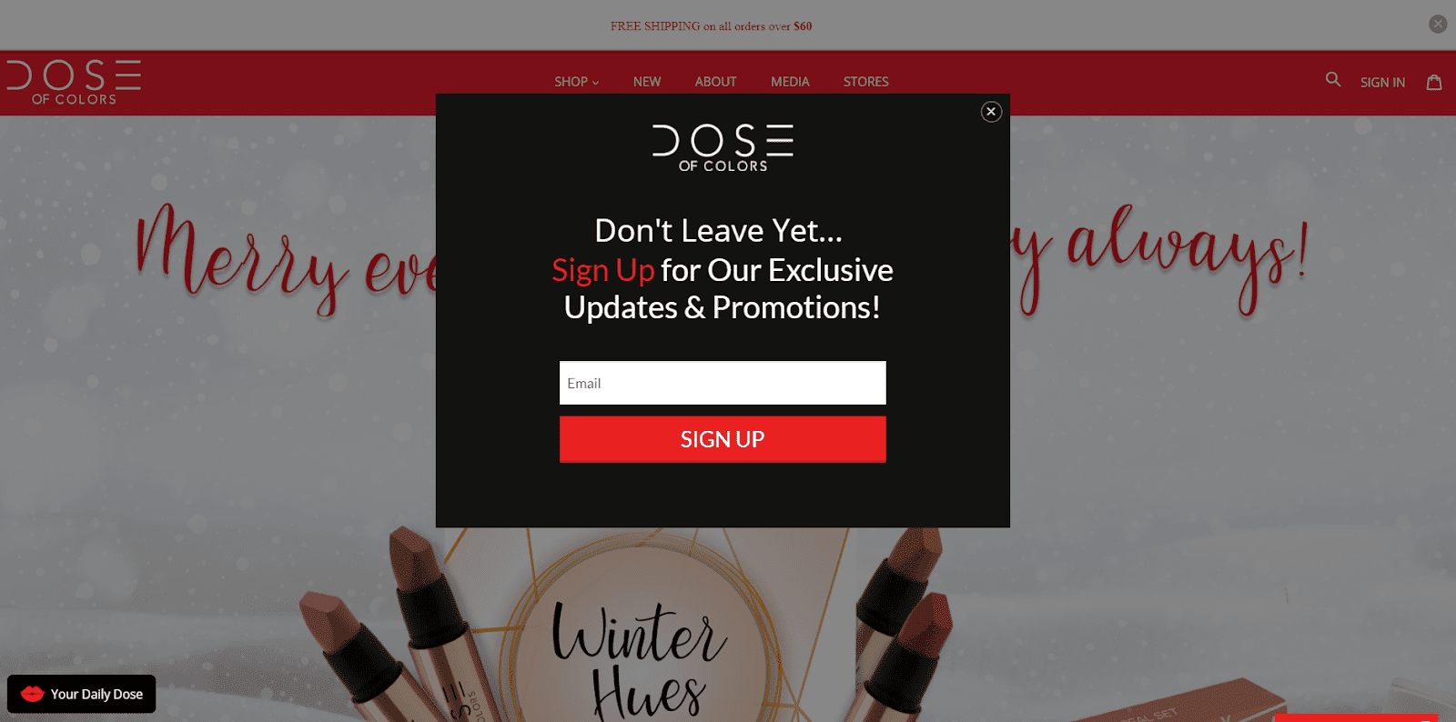
Dose of Colors urges visitors to not leave yet and pushes them to sign up for exclusive updates and promotions. The use of the word “exclusive” here taps into the consumer's need to feel wanted and special.
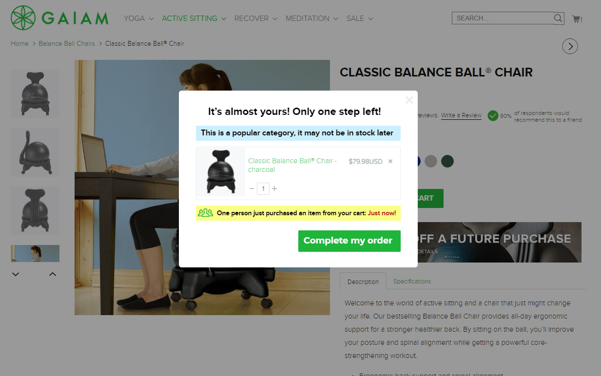
Taking it one step further, Gaiam reminds shoppers they have an item in their cart (and supplies are limited!). Creating a sense of urgency and scarcity is a great way to kick visitors into action.
3. Inject brand personality
Standing out is key for brands in busy e-commerce verticals.
The surge in online stores during the Covid-19 pandemic has created a fierce pool of competition in many industries, and it has made it increasingly difficult for brands to get the attention of buyers.
Brand personality sets you apart and helps cement relationships with potential buyers. This goes back to the consumer need for connection with brands - something that has never been more important this year after months of isolation and stay-at-home orders.
Inject your email popups with brand personality to forge a connection with subscribers.
The key is to keep it simple.
Speak like you would to a real person and make sure your popup messaging is on-brand with the rest of your site and communications.
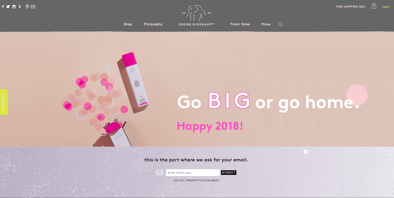
Drunk Elephant is a great example of a brand with a fun personality. They have a dry sense of humor, and their email popup copy reflects that.
You can have fun with your email popup copy, too.
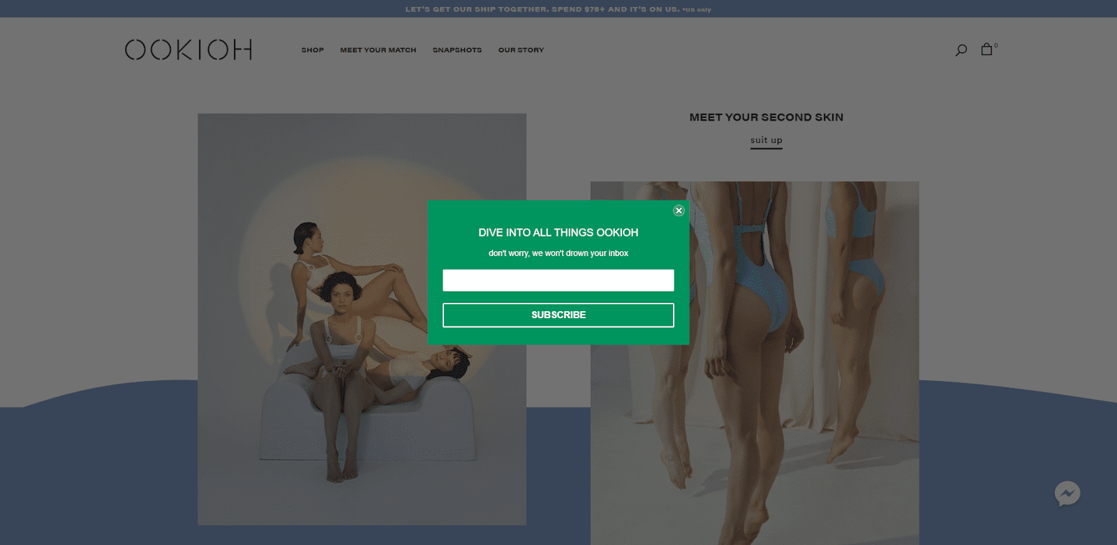
OOKIOH uses a play on words to attract subscribers and encourage them to sign up (we’re pretty sure the promise of “not drowning your inbox” goes a long way in encouraging signups as well).
4. Provide a social option
Inboxes are one of the last sacred places consumers have left - and even then, they can still be the last place consumers want to spend their time.
It’s no surprise then that visitors might be reluctant to hand over their email addresses. After all, who really wants yet more emails clogging up their already-full, probably-overflowing inbox?
Luckily, email isn’t the only way you can capture visitors’ information. Give them a choice and make them feel comfortable enough to give you the chance to show up in a place they’re already hanging out - like social media.
People are spending an increasing amount of hours scrolling through their social feeds this year, providing the perfect opportunity for you to show up and connect with them there.
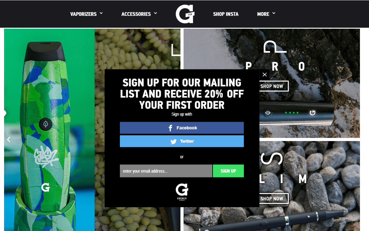
Grenco knows this and uses it to their advantage on their store.
The brand gives subscribers the chance to sign up through Facebook or Twitter if they aren’t ready to hand over their email address.
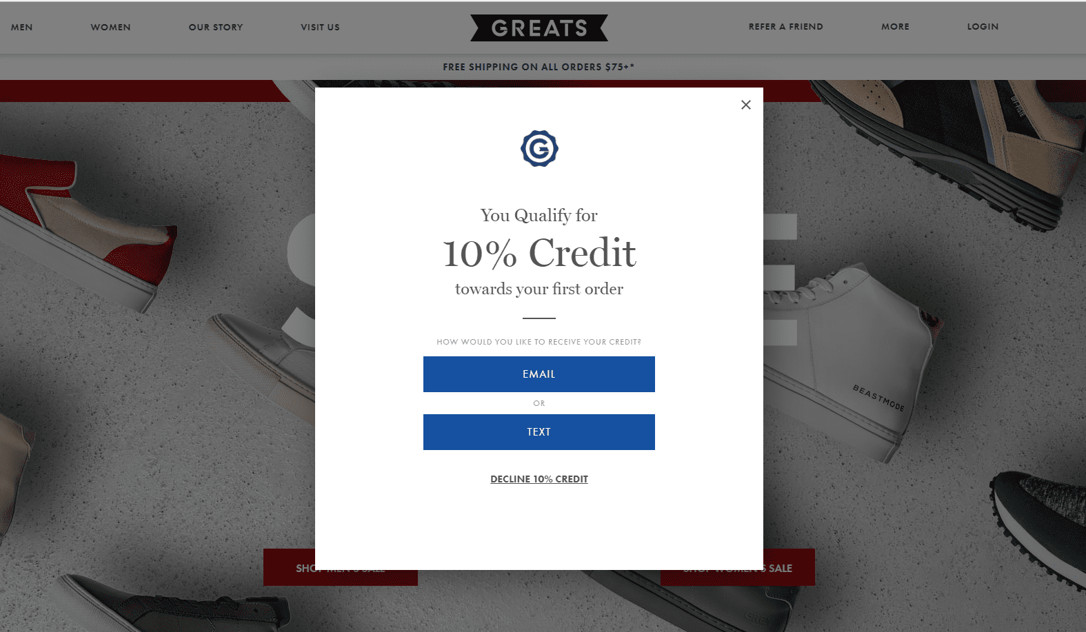
Likewise, Greats lets subscribers choose to receive correspondence via email or text. Often, text can be an even more powerful and intimate way to reach people because they always have their phones to hand.
5. Clear CTA
Calls-to-action (CTAs) are one of the most important parts of your email popups. They tell visitors what to do next and give them a nudge in the right direction.
Despite their reigning power, there are still plenty of brands that don’t use them to their full potential.
Don’t fall foul of the boring “subscribe” or “submit” CTA.
Instead, make visitors want to click the button and join your email list.
Let them know exactly what step you want them to take next and what will happen when they do hit the button.
Another handy tip is to put the visitor at the center of your signup form by writing the CTA from their perspective and using first-person pronouns, like “I”, “me”, and “my”.
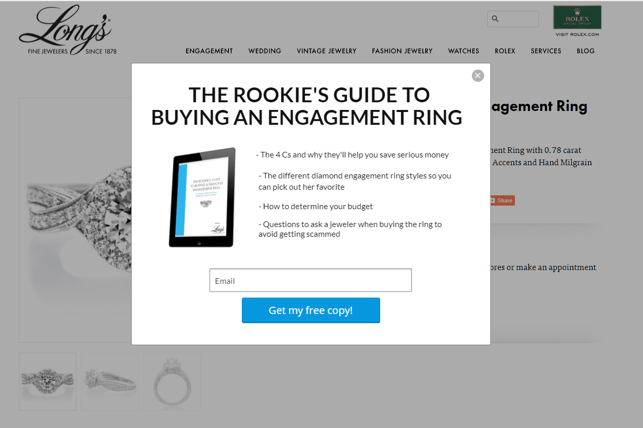
Long’s Jewellers offers a free download for subscribers so they get something in return for their email address, but it’s the CTA that seals the deal. They make good use of the word “my” and incorporate the word “free” for a double whammy.
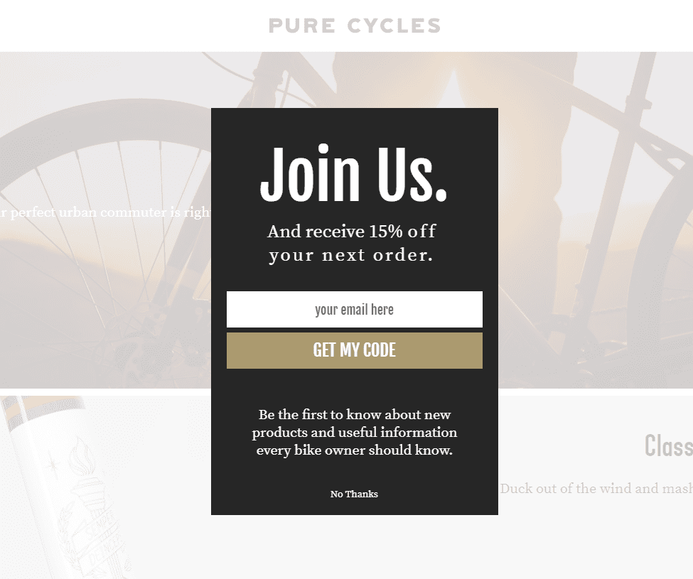
Pure Cycles does the same.
Subscribers are in no doubt as to what they should do next and, more importantly, what will happen when they hit the subscribe button (they also offer a discount which makes it even more compelling).
Level Up Your Email Popups
Getting the attention of online shoppers has never been harder and the surge in new stores has forced brands to reconsider the way they connect with consumers.
Email still remains one of the most effective lead nurturing methods with an incredibly high ROI compared to other techniques.
But getting leads is the hard part, especially when you’re up against fierce competition.
The solution is powerful and compelling email popups. They capture shopper information and start cementing a relationship straight away. The key is to make your popups as good as they possibly can be through irresistible incentives, brand personality, strong CTAs, and an element of choice.
Now you know how to level up your pop-up game for your online shop, the next step might be to fulfill your whole potential by optimizing your logistics. Have a look at byrd's offer of fulfillment for Shopify shops.